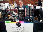
I’ve been mostly off the grid lately creating jewelry for several upcoming Christmas craft sales
- November 16th “Something Special Craft & Gift Sale” 10am – 4pm at the Fort Saskatchewan Legion in Fort Sask., AB
- November 23rd “Christmas in the Country” 10am – 4pm at the St. Michael Rec Center in St. Michael, AB
- November 30th “Christmas Marketplace” from 12pm- 7pm at the Dow Centennial Center in Fort Saskatchewan, AB
and
working on branding my home Art & Jewelry Biz which can be a fine blend of fun and daunting, especially when you are a one woman show (who is pregnant and juggling a toddler lol)
But it’s all been coming along pretty well, I just despise all the initial start-up costs, (some day I will get ahead *Lord willing*)
I’ve never really been one for branding, probably because I like to dabble too much and hate the pretensions that can go with a marketed image but I do understand the power of advertising.
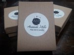
So I started working on all the paraphernalia that is required to make a business really pop, the packaging & displays!
And what better way to do that than through COLOUR!
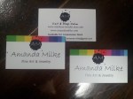
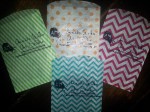
I tried to keep things simple but bright.
All my displays are black because it makes the perfect backdrop for all the colors I use.
And I didn’t want to be tied down to the stereotypical paintbrush icon so instead I used a color spectrum and a black splash of paint with my initials as my logo, simple yet bright and isn’t too constraining to be tied down to.
I’m pretty happy with it.
Cheers,
Amanda
