I want to start off by saying I love pop art.
Some of my favorite artists were part of the pop art movement. (Lichtenstein being at the top of my list.)
I think it’s the bright colors that pull me in, (in case you haven’t notice I tend to use a lot of color in my work).
That being said, tonight’s piece is another friend tribute.
I loved her new profile picture and had to swipe it.
I’ve been staring at it for probably months now trying to decide how to approach it.
I even did a version in marker (simplified colors like my yelling man) but it just didn’t turn out right.
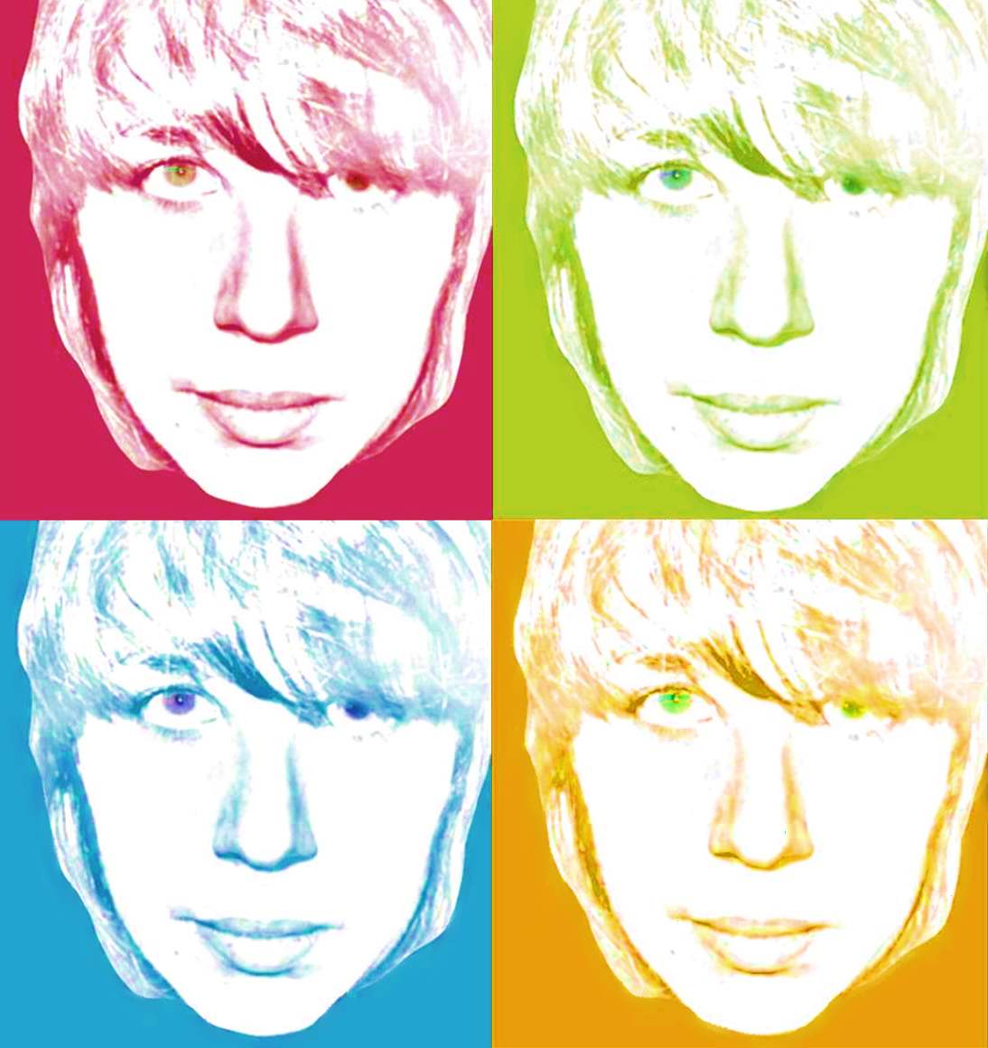
I didn’t want to loose any of the subtleties of the picture so tonight I decided I’d do a Warhol inspired version of her.
The thing is, I couldn’t decide on which color scheme to go with. I think both suit her personality.
I guess I’ll let you decide which you like better. (Of course Eve gets the final say as to which (if either) is the better one 🙂 )
Here she is, “Eve” pop art version 1 & 2

*
*
*
*
*just thought I’d space them out a bit
*
*
*
*
Right so there they are.
Of course I’m biased and like them 😛 lol
Let me know how they look.
Cheers!
A
Oh ya, this is week 7!

I like both of them…but the second one with all the bright colors..is a fun one!
nice work hun!
Jen
LikeLike
I think I like the first one better, but then, I’m more of a dark color person.
I just find that this picture (through no fault of yours) doesn’t have enough of her ever-present smile, so I don’t feel anything done with this picture can adequately capture her.
But that’s my opinion.
LikeLike
Have you forgotten J? She’s aiming to make everyone depressed/pensive! Hehe. I would go with the first one as well, though the extra exposure in the second one managed to make her eyes kinda crazy (in colour), which is neat. Hmm . . . now that I’m looking between the two, the first one starts to look boring by comparison. Err . . . jury’s out.
LikeLike
Setting:
padded bright white room
First off I don’t think Eve looks depressed, calm maybe but not depressed.
Second I think I like the second one better too, it’s just brighter and
Third maybe I’m psychologically making everyone look depressed because my subconscious/ego can’t grasp the fact that you all could still be happy without us around…but it’s not true right…you miss us right…right? Hello? Is anyone there? (echo)
Scene fades to black
LikeLike
sorry for the late reply. Blaming new shift…. !!! Thanks Amanda, I like both, however would have to agree with J and W that I like the second better. Although you picked my favorite colors in the first 🙂 I like the second because my eyes are kind of crazy… good crazy at that.
I think i look pensive as well, but that’s ok! I’m pensive sometimes…. it happens… ahem. So thanks, Amanda i really like them, and appreciate it!
LikeLike
lol no prob ;P
LikeLike